
Create a Custom Focus Mode to Keep Color Backgrounds Visible

There are many aspects to building a Power BI dashboard. The layout and design are arguably as important as any other aspect. It is what draws the attention of the viewer, it can reveal powerful insights that can go unseen with other designs, and a good design can make a report look straight up [insert fire emojis].
Some may call it a trend or a fad, but it’s no secret that reporting builds with a “glass effect” or “Glassmorphism” design is catching more and more eyes. If done right, this type of design can really take your reporting experience to the next level and make visualizations pop.
This type of design usually requires a dark color or blend of colors for the report’s background. In the past, clients have also provided a photo or image they want as the background, or the first layer of the report.
The second layer is usually either the report visual itself (chart, graph, card, etc.) or a shape placed behind a visualization to give a “frosted” effect. If it’s a shape, it can be placed behind a report visual or a group of visuals, set with a background color, commonly a lighter color, and some level of transparency. 50% transparency is a good place to start and adjust from there. Whether your visualization is the second or third layer, you can apply background settings to the visual itself or disable the visual background entirely. Disabling the visual background will provide a full glass effect, making the visual details – data values, chart axis, graph lines, etc. – sit right on top of the chosen report background. With the right color combination and visual placements, you can create a sharp looking report.
The problem is that if the report’s background is anything other than light colors, you will need light colors or even white for the visual details. The crisp color contrast is not the problem, it is when your end user wants to expand the visualization – or use Power BI’s Focus Mode. A little known problem in Power BI is that regardless of visual or report background color, the visual will have a white background when it is expanded into Focus Mode. It will be nearly impossible for the end user to see any white or light colored visual details on top of a white background.
In February, I attended Reid Haven’s livestream with Ben Ferry as the guest speaker. Ben was showcasing some of his tips ‘n tricks with custom visual solutions. One of these solutions was the use of bookmarks, buttons and enlarged visualizations to create a customized version of Focus Mode. A brilliant customization in itself to avoid any limitations posed by Power BI’s native Focus Mode. I couldn’t help but to immediately think of a recent project where the full glass effect design with white visual details had to be compromised for Focus Mode. For me, Ben’s solution would serve another purpose!
How to Build the Custom Focus Mode
I encourage you to view Ben’s original YouTube tutorial on how to build his custom Focus Mode, or ‘presentation mode’ as he calls it. We may have slightly different methods when you get into the details, but the fundamental process is the same. The purpose of Focus Mode is to expand a visual to see more detail. Many times, this is done because a visual is too crowded - from a design perspective, that should be avoided.
As Ben shows, the customized Focus Mode does not need to look like the native Focus Mode at all. You do not need to use the entire space for one visual. You can use some of the remaining space for a background, slicers, and other related items. You can even add a custom tooltip if you’d like.
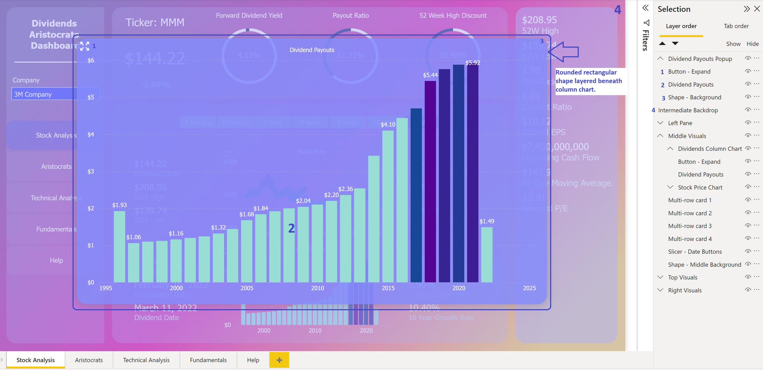
Below, I describe the steps I took to build a custom Focus Mode. The example will use a column chart from one of my reports.
Expand Button
From the Insert tab, insert a Blank button and reduce the size small enough to fit somewhere on the bar chart. I have my button on the top left.
In the Format pane, deselect all options or toggle buttons from both the Button and General pivots. Navigate to the Style section within the Button pivot and toggle on the Icon option.
Under the Icon type dropdown, I selected Custom and uploaded a .png image file of an expand button from icons8.com. This will fill the blank button with the image I upload. You can also choose to use any of the default buttons that come with PBI or create your own custom button.

Then, toggle on the Fill option.
You can apply a custom setting for each state. For example, customize how your button looks by default, when you hover over it, and when you press it. For the default state, I have the transparency set to 100%, but on hover, I have the transparency set to 50% and the color set to a light gray. When the button is pressed, I set it the color to a light blue at 50%. Doing this allows the end user to recognize that there is a button they can interact with as they hover over it. Later, we will apply a bookmark in the Action section of the Format pane.
*Note: Make sure the button is layered on top of the visual by utilizing the Selection pane. You can open the Selection Pane by going to the View tab and selecting the Selection button.

Default Bookmark

From the View tab, select the Bookmarks button. In the Bookmarks pane, create a new bookmark, name it Default, then right-click and deselect Data. Here is more information on creating bookmarks.
Backdrop for Custom Focus Mode
From the Insert tab, click the Shapes button and insert a rectangle. Enlarge the shape so it covers the entire canvas. Make sure to layer it over all the visuals from the Selection pane. This will serve two purposes; it will be the backdrop when we expand our visualization, and it will be coupled with an action in case the end user clicks outside of the expanded visual. You can decide to set this at any level of transparency. In this example, I’m setting it to a light blue color, 50% transparency, and eliminating all other options including the border.

Toggle on the Action button from the Format pane and use the Default bookmark we created in the previous step.
Custom Focus Mode Visual
Next, duplicate the column chart – you can copy and paste it right onto the canvas. Then resize and position the chart to your preference for your custom Focus Mode. I have my visual centered.
This is where you will notice if you need a different color or transparency on either your backdrop or the visual background. Instead, I added another shape and layered it between the backdrop from the previous step and the column chart we just created. I used a blue color with 15% transparency, turned on the outline with the same blue color, and used a dark gray shadow that is centered so the visual looks like it pops out.
Then I added the same expand icon button as in the chart from the default view.
Now add the default view bookmark to the button in the Action section of the Format pane. When the end user presses the expand button from the custom Focus Mode, it acts as if it is shrinking the visual back down to the default view.
Notice that I numbered the visuals according to their layer order in the Selection pane.
Once your custom Focus Mode looks they way you want it, add another bookmark for this view.

Conclusion
Now that we have this solution in our back pockets, function over form may seem so passé. It is exciting that we can go full glass effect and keep Focus Mode…well, arguably a better version of it. This may be a great solution for many businesses who are looking for that bolder, crisper look that a glass effect dashboard provides, but absolutely need the ability to enlarge certain visualizations.
One thing I would note before going this route, as in any type of dashboard design, is to be aware of color blind accessibility and the options your report provides. Make sure your client is aware of any limitations posed by certain design features and available options before a buildout.
You may need to update the Default view bookmark and make sure the pop-up visuals are hidden. Here is a look at my Default bookmark. Notice the hidden visuals in the Selection pane. I also have grouped sections.
Now add the second bookmark as an action to the original expand button you created earlier.
Be sure to test out your buttons by pressing Ctrl + Left Click.