
Filter Power BI Report by 2 Date/Time Ranges

Ever needed to filter a report between a specific start date/time and end date/time but couldn’t do it with the basic date filter in Power BI? This post will show how to solve that issue using the native Power BI tools and filters.
I had a client ask me to solve this issue for him. He had manufacturing machines running 24/7 and could view their real-time productivity in his Power BI dashboard. Periodically, these machines would throw some errors and calibrate. Data was provided for each period of downtime, from the date and time it began to the moment it ended. He wanted the ability to view these periods downtime, for example, each period between February 6th at 7:29 AM and February 7th at 9:34 PM. This was critical for him so he could dive into all the details of the affected machines during these periods.
Normally, you would think that’s simple – drop the date time fields into a couple of time slicer. Nope. Only the dates will show up in the slicer. Even if you create a second slicer for the time, you would need to display the slicer as a List or Dropdown so it doesn’t show up as a date – and even then your start time filter selection will apply to each day in the table making it impossible to select the desired end point.
In this example, I used data from timeanddate.com to show daily sunrise and sunset times in Seattle and Anchorage. We will need four disconnected slicers – Start Date, Start Time, End Date, and End Time. The Start Date and Time slicers will represent times for sunrises and End Date and Time slicers will represent times for sunsets.
First off, if the fields you are using are in Datetime format, split them into two columns and use the Date format and Time format in Power Query:

In this example, my fact table is named ‘Sun’ – hence sunrise and sunset times. After you have loaded the data model, you will create four custom DAX tables, one for each of the four slicers mentioned earlier.
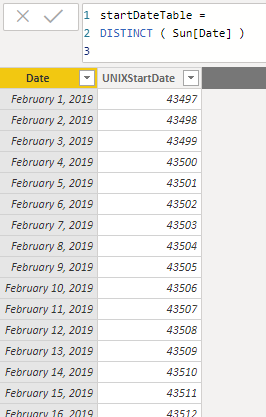
To create these new tables, select New Table in the Modeling tab and create the start date table. The date column in this table will refer to the unique dates from the start date column in your fact table (sunrise dates for this example). Since Power BI tends to default to Date/Time format, convert the column to Date format. Follow the same process for the end date table referring to the end date column in your fact table (sunset dates for this example).
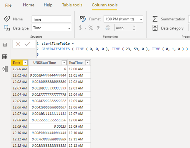
Now that we have created both the start and end date tables, we will create the start and end time tables using the GENERATESERIES function. In this example, the tables will have a row for each minute of the day, which we’ll end up using as slicers. GENERATESERIES requires start and end values, and an optional incremental value. We will input all three values using the TIME function (hour, minute, second). As shown below, we start at 12:00 AM and end at 12:59 PM using 1 minute intervals. Make sure to set the ‘Time’ column to Time data type.
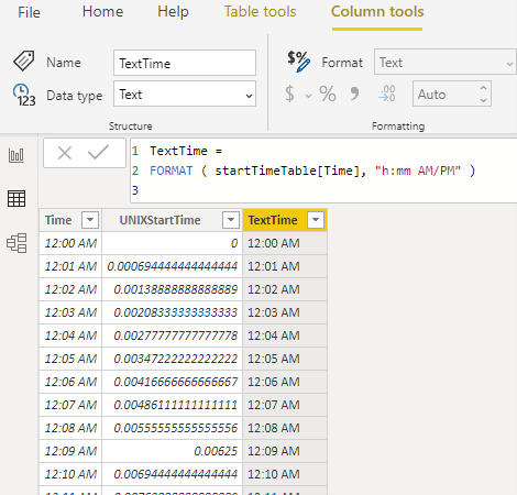
The value you will put into the slicer visual will be the column ‘TextTime’, which is a custom column that converts the ‘Time’ column into text. Make sure to set this to Text data type.
Follow the same process to create the ‘endTimeTable’.
In the Report view, add four slicers using the Date columns and TextTime columns we just created. Power BI defaults to the date slider but I like to use the dropdown slicers for these. Since there are 1,440 rows in the time tables, I added a search bar in the dropdown too.

This image shows a table visual with fields from the fact. The visual is filtered by those slicers – anytime between February 1st at 8:00AM and February 6th at 6:00 PM. But, since these four filter tables do not have relationships, how did I filter the visual?
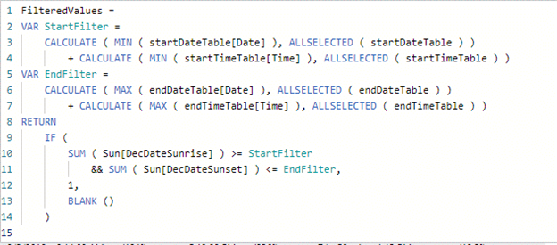
Easy. I filtered the visual with a measure I called ‘FilteredValues’, as shown below. Add this measure to the visual filter pane and make sure it is set to “is not blank”. I’m sure there’s other ways of writing this in DAX, but this is how I did it.
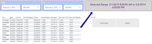
As a bonus, you can add a card with a measure that shows the user the time range they have selected, as shown on the top right corner.
Here is the measure for that text, which I called ‘RangeText’:
